What Have We Learned from the Engineers’ Non-Conference Start to the Season?
Analyzing the 4-1 start through the lens of our new xG model
After one scrimmage, two exhibitions, and five games that actually count, we now have a good chunk of data on how the team has performed so far. So naturally, we built an expected goals model.
Our Pseudo Expected Goals Model
Last time, we looked at shot quality through the lens of how many scoring chances each player generated individually (we’ll dig into this a little later), and the difference between how many scoring chances they were on the ice for versus how many they gave up to the opposition. A plus/minus for scoring chances.
But there is a way to take this a step further. When tracking scoring chances, we designate them as either “medium-danger” or “high-danger” – using Natural Stat Trick’s definitions. “Low-danger” chances are not even considered true scoring chances just because they typically have such a low probability of becoming a goal. We ignore those in this xG model for this very reason.
Next, we said that a “high-danger” chance is 3x more likely to hit the back of the net than a “medium-danger” chance. This may not be completely accurate (this is v1.0 of the model after all!), but it should be in the ballpark. As we get through the season, we will get more data on how many medium and high-danger chances actually result in goals, so we can refine that number further.
All that’s left is to put it all together to spit out an actual Expected Goal Percentage (5v5 xG%). I think the best way to look at it is: of all the scoring chances that occurred when a certain player was on the ice, how many of those were for RPI. And of course, we weight the high-danger chances three times higher than the medium-danger ones.
The 5v5 xG Rel% column takes an individual player’s expected goals percentage and from it, subtracts the team’s average expected goals percentage when that player is not on the ice. It gives a good idea of how much of an effect a certain player is having. A negative xG Rel% suggests that the team is performing worse than average from a shot quality battle perspective when that player is on the ice.
Here’s how it all looks:
As a little side note, we have only included players that have played in at least half (4) of the games so far this season, just because you can get some wacky results with small sample sizes. We’ll get a clearer picture of where guys like Nykanen, Brown, Ciccarello, and Leibold stand when they have a couple more games under their belt.
Now, I’m not going to claim that this model is even close to perfect, but I do think that it’s a good tool to use to analyze different guys, especially when used in conjunction with the eye-test. Brackett and Evans, for example, are two guys who sit atop the table and pass the eye test. Brackett always seems to have the puck moving towards the goal and Evans does a great job of getting into dangerous areas and getting off shots.
Obviously, they aren’t currently the top scorers on the team, but in theory, this table should be more predictive of their future success than their current points total. So, keep an eye out for that Brackett-Muzzatti-Evans line – it’s real good.
On The Defensive Side of Things
Expected goals percentage is not solely measuring offensive output, it’s also measuring how good a player is at helping prevent goal scoring chances. It can be quite difficult to just measure how well a player is performing defensively on ice, but we can do it in a slightly indirect way.
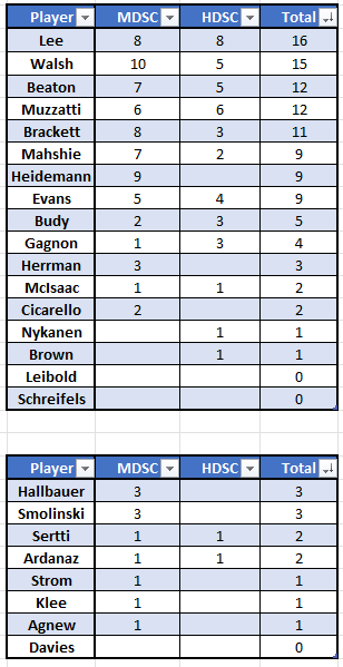
First, we look at individual scoring chances created, which should give a decent picture of how well a certain player (especially a forward) is doing offensively. Now, if there are players who sit towards the top of the of this list, yet have lower xG numbers, then it suggests that they might be giving up too many quality chances defensively, despite being good in the offensive zone.
The reverse of this is also true – fewer chances created, but a good xG percentage implies that a player is good at suppressing chances but might not be as good at creating them.
As I said earlier though, these tables aren’t the be-all and end-all of a player’s quality. You could even make a good case that eight games is way too small of a sample size to be looking at this stuff just yet. But I like to think of them as good tools for learning more about what players have done well at and where they might succeed going forward.
I do plan on making all this data (along with my Corsi tracking) public soon - likely on a Google Sheet or something similar, so do keep an eye out for that. The game is played on a spreadsheet after all, right?


